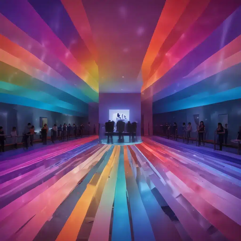
Unlocking the Power of Color in Interior Design
As a seasoned construction professional and interior designer, I’ve witnessed firsthand the profound impact that color can have on the psychology and well-being of individuals within a space. Color is more than just an aesthetic choice; it’s a powerful tool that can shape our emotions, influence our behaviors, and even impact our physiological responses.
In this comprehensive article, we’ll explore the science behind color psychology and how you can leverage this knowledge to create transformative interior environments. From understanding the unique attributes of various hues to crafting cohesive color schemes, we’ll delve into the strategies that can elevate your design projects and enhance the overall experience for your clients.
The Fundamentals of Color Psychology
Color psychology is the study of how different hues and their properties – such as hue, saturation, and value – can elicit specific emotional and physiological reactions in individuals. This field of study has been explored for centuries, with pioneering contributions from luminaries like Isaac Newton and Johann Wolfgang von Goethe.
At the core of color psychology are the primary colors: red, yellow, and blue. These foundational hues serve as the building blocks for a vast array of shades, tints, and tones that can evoke a wide range of emotions and responses.
Red, for example, is often associated with intensity, passion, and energy. Muted shades of red can evoke feelings of love and sensuality, while brighter hues may trigger a sense of power and strength. https://mhanational.org/surroundings/color-psychology-explained
Yellow, on the other hand, is widely regarded as a hue that inspires happiness, optimism, and creativity. Its association with sunlight and warmth can have a revitalizing effect, though too much yellow can also induce feelings of anxiety or stress. https://mhanational.org/surroundings/color-psychology-explained
Blue is often described as the most calming and soothing of the primary colors, promoting relaxation, introspection, and spiritual awareness. Light blues can aid in sleep and reduce feelings of sadness, while darker shades may evoke a sense of melancholy or depression. https://mhanational.org/surroundings/color-psychology-explained
Beyond the primary colors, the secondary hues – orange, green, and purple – also hold unique psychological properties. Orange, a blend of red and yellow, can stimulate enthusiasm and passion, while green is associated with balance, harmony, and growth. Purple, a combination of red and blue, can inspire creativity, wisdom, and a sense of luxury.
Contextual Considerations in Color Psychology
It’s important to note that the psychological impact of color is not straightforward or universal. The way an individual perceives and responds to a particular hue can be heavily influenced by a variety of factors, including gender, nationality, personal experiences, and cultural associations.
For instance, research has shown that men and women often have distinct color preferences and perceptions. Men tend to gravitate towards bolder, more saturated colors, while women generally favor softer, more muted shades. https://appliedpsychologydegree.usc.edu/blog/color-psychology-used-in-marketing-an-overview
Additionally, the cultural context in which a color is experienced can greatly shape its emotional and symbolic meaning. What may be considered a calming, serene color in one culture could be associated with mourning or negativity in another. https://appliedpsychologydegree.usc.edu/blog/color-psychology-used-in-marketing-an-overview
As an interior designer, it’s crucial to consider these contextual factors when selecting colors for your projects. Conducting research on your client’s demographics, personal preferences, and cultural background can help you make more informed and impactful color choices.
Crafting Cohesive Color Schemes
Leveraging the principles of color psychology is not just about choosing the “right” hues; it’s about creating harmonious, visually appealing color schemes that evoke the desired emotional response in your clients and their guests.
One of the most fundamental color schemes is the monochromatic approach, where you use various tints, tones, and shades of a single color to create a soothing, unified look. This can be particularly effective in spaces where you want to promote a sense of calm and tranquility, such as a serene bedroom or a meditation room.
Alternatively, you can explore complementary color schemes, which pair hues that are opposite each other on the color wheel. This bold, high-contrast approach can energize a space and create a sense of vibrancy, making it an excellent choice for areas where you want to stimulate creativity and activity, like a home office or a dynamic living room.
For a more nuanced approach, analogous color schemes, which utilize hues that are adjacent on the color wheel, can offer a harmonious, visually cohesive aesthetic. This can be particularly effective in creating a cohesive flow throughout an open-concept floor plan or a space that transitions seamlessly from one area to another.
Regardless of the specific color scheme you choose, it’s essential to consider the overall mood and atmosphere you want to cultivate in the space. Carefully selected window treatments, such as flowing drapes or contemporary roller blinds, can play a crucial role in enhancing the color palette and reinforcing the desired psychological impact. https://www.stoneside.com/resources/articles/interior-design-understanding-the-psychology-of-color-in-spaces
The Transformative Power of Color
As an experienced construction professional and interior designer, I’ve witnessed firsthand the transformative power of color in shaping the overall experience of a space. By understanding the science behind color psychology and leveraging its principles in our design approach, we can create environments that not only delight the senses but also have a profound impact on the well-being and productivity of those who inhabit them.
Whether you’re embarking on a major renovation project or simply looking to refresh the aesthetic of a room, I encourage you to explore the nuances of color and how it can be used to elevate your design. By tapping into the science of hue, you can unlock a world of possibilities and create truly exceptional, impactful spaces that enrich the lives of your clients.
To learn more about how Stoneside Blinds & Shades can help you incorporate color-enhancing window treatments into your design projects, visit our website or schedule a free consultation with one of our experienced designers today.


